Monthly Studio Review #2

(An experiment in which I look back at a month of my creative life at the start of a new one. See last months’ here.)

1. Paintings on Canvas

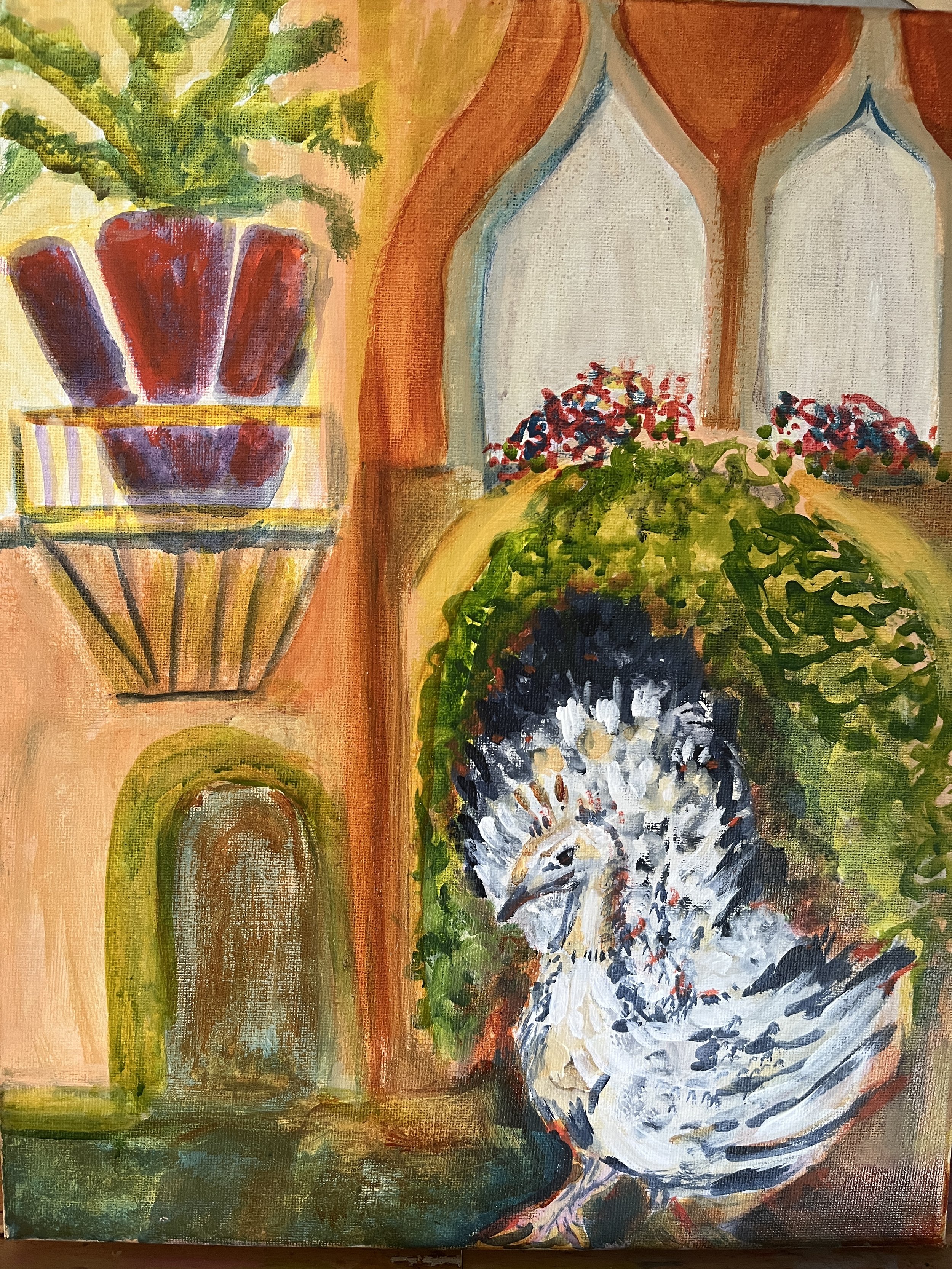
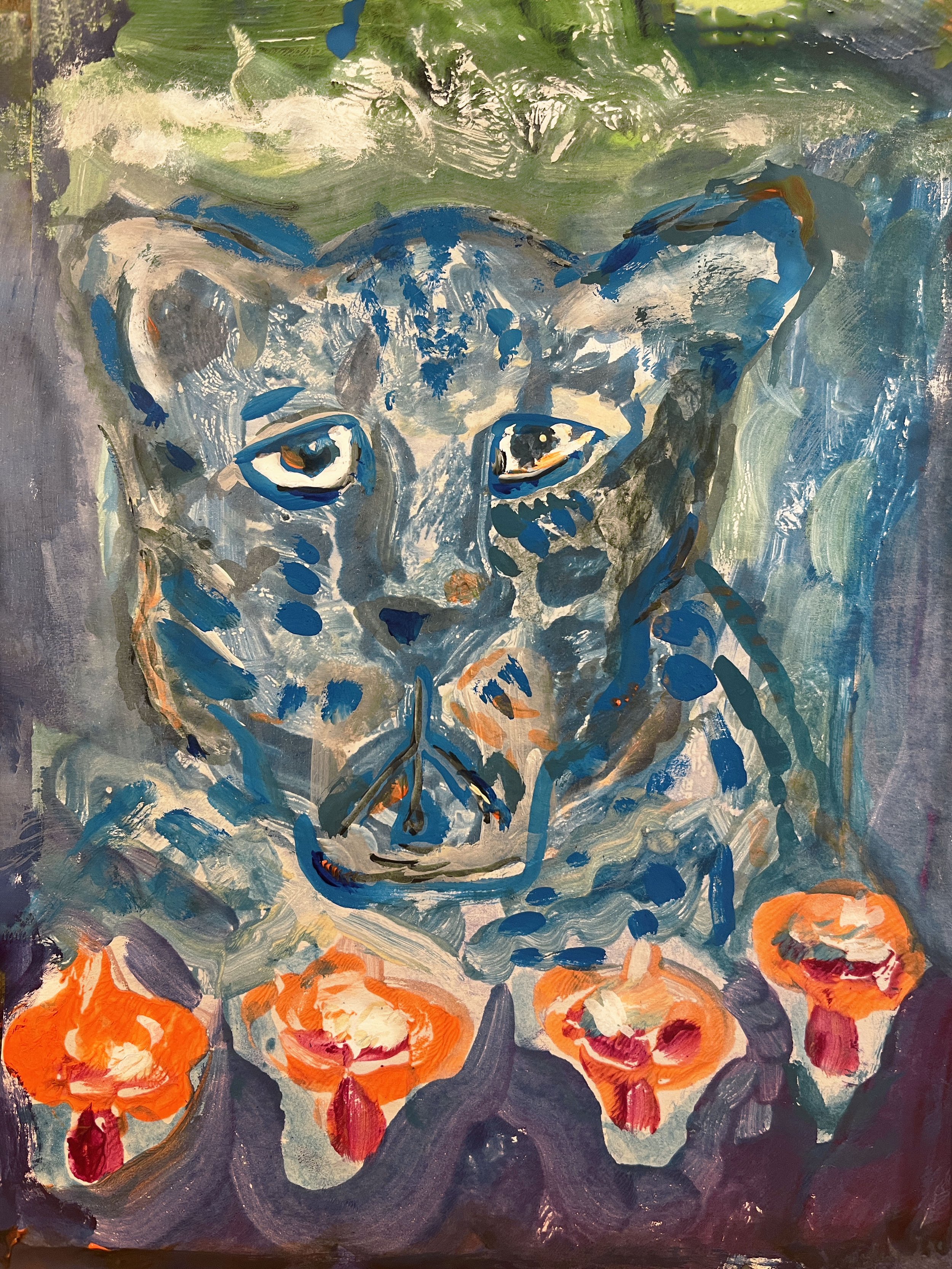
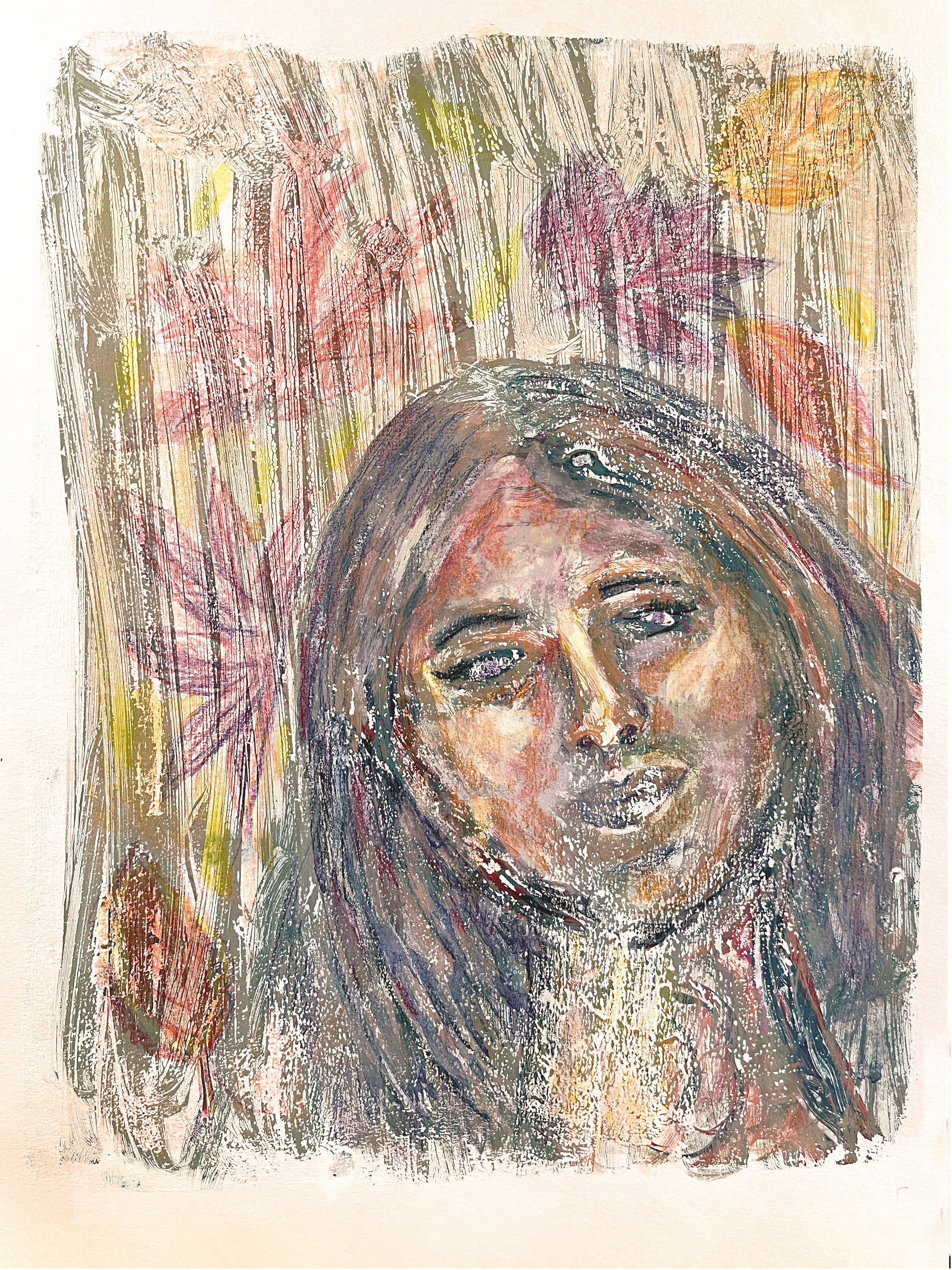
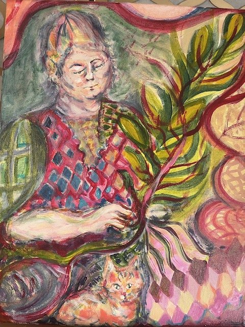
I completed three 11x14 inch acrylic paintings on canvas, the first work I started and finished in the new studio. I posted a couple of these last month and mentioned my process here. I seem to be continuing with the “animals in unlikely places” theme, more to come on that.

Process note: It took me longer than I expected to settle in and feel comfortable working here, in the third bedroom in our new home. Unpacking and organizing took forever, and then I had to spend some time just hanging out in the studio, doing other things besides artwork. (I was easily working on sketchbooks and art journals in the living room and dining room, that’s always felt more fluent to me.) Since I was physically unable to spend as much time here as I’d have preferred, due to caregiving responsibilities, it kept feeling like re-entering a brand new space. Honestly, I had no idea I was so space sensitive — previously I was working in a screened-off corner of the dining room! But now my studio space is starting to feel like a creative ally.

2. Location Drawing

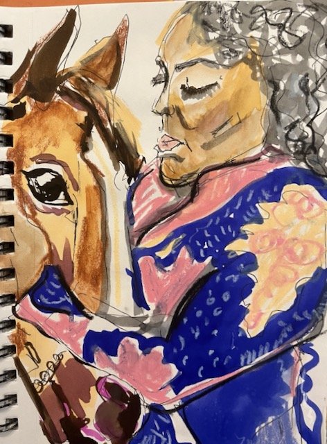
Lots of location drawing, which gives life to my years. I’ve previously posted a number of them here.

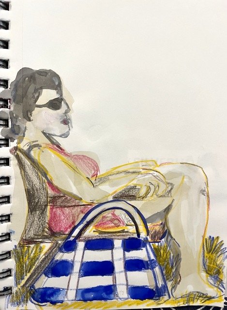
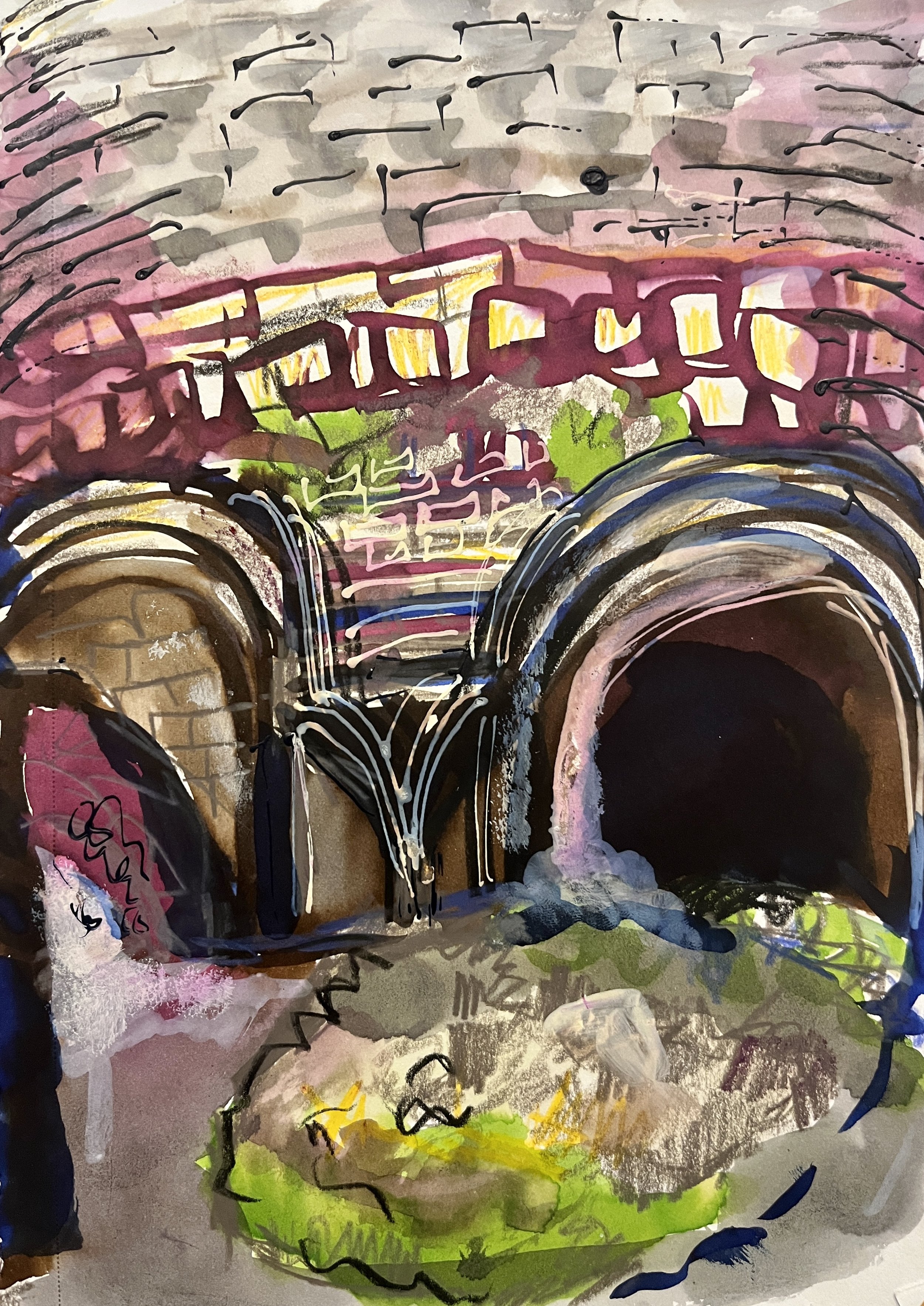
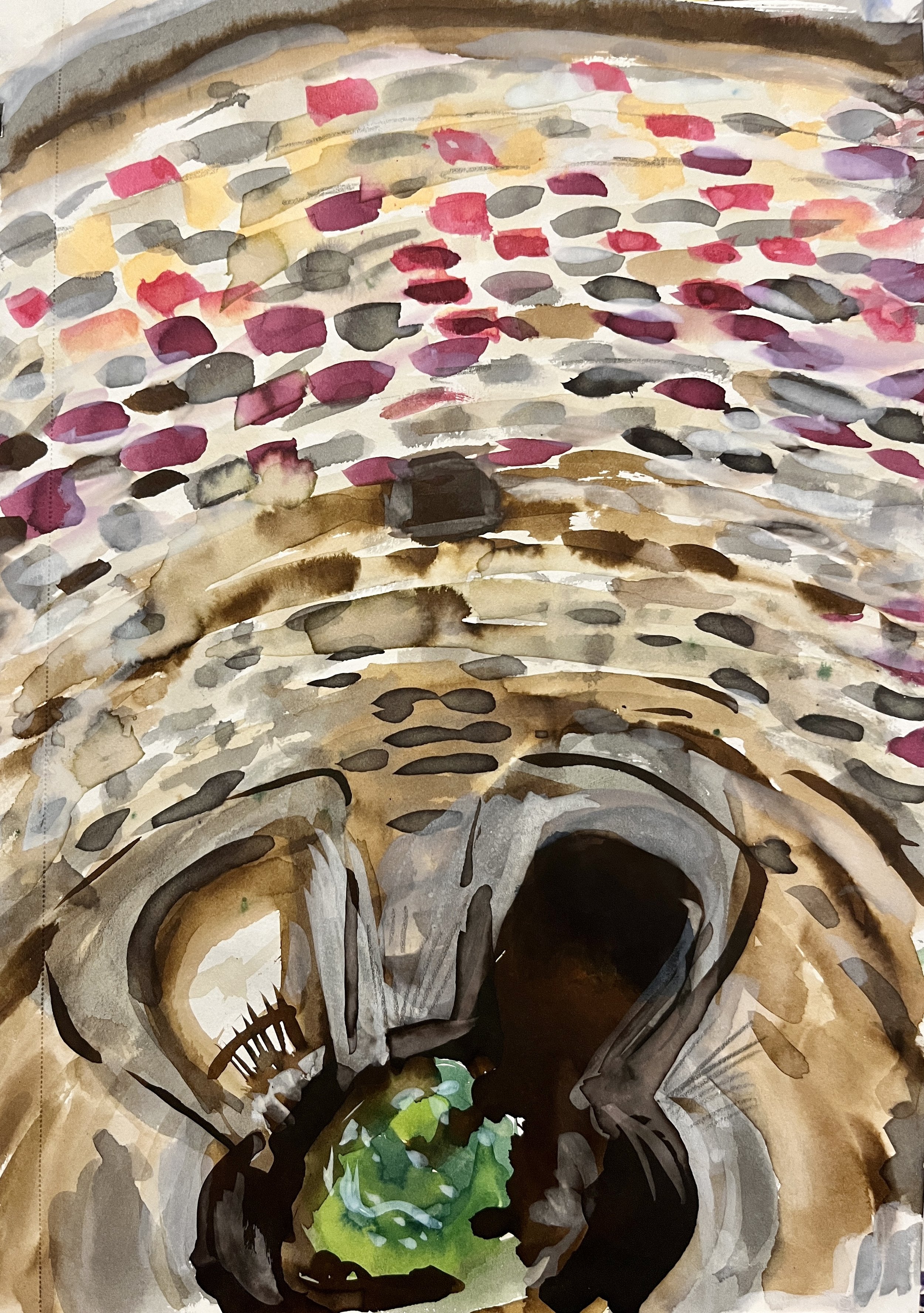
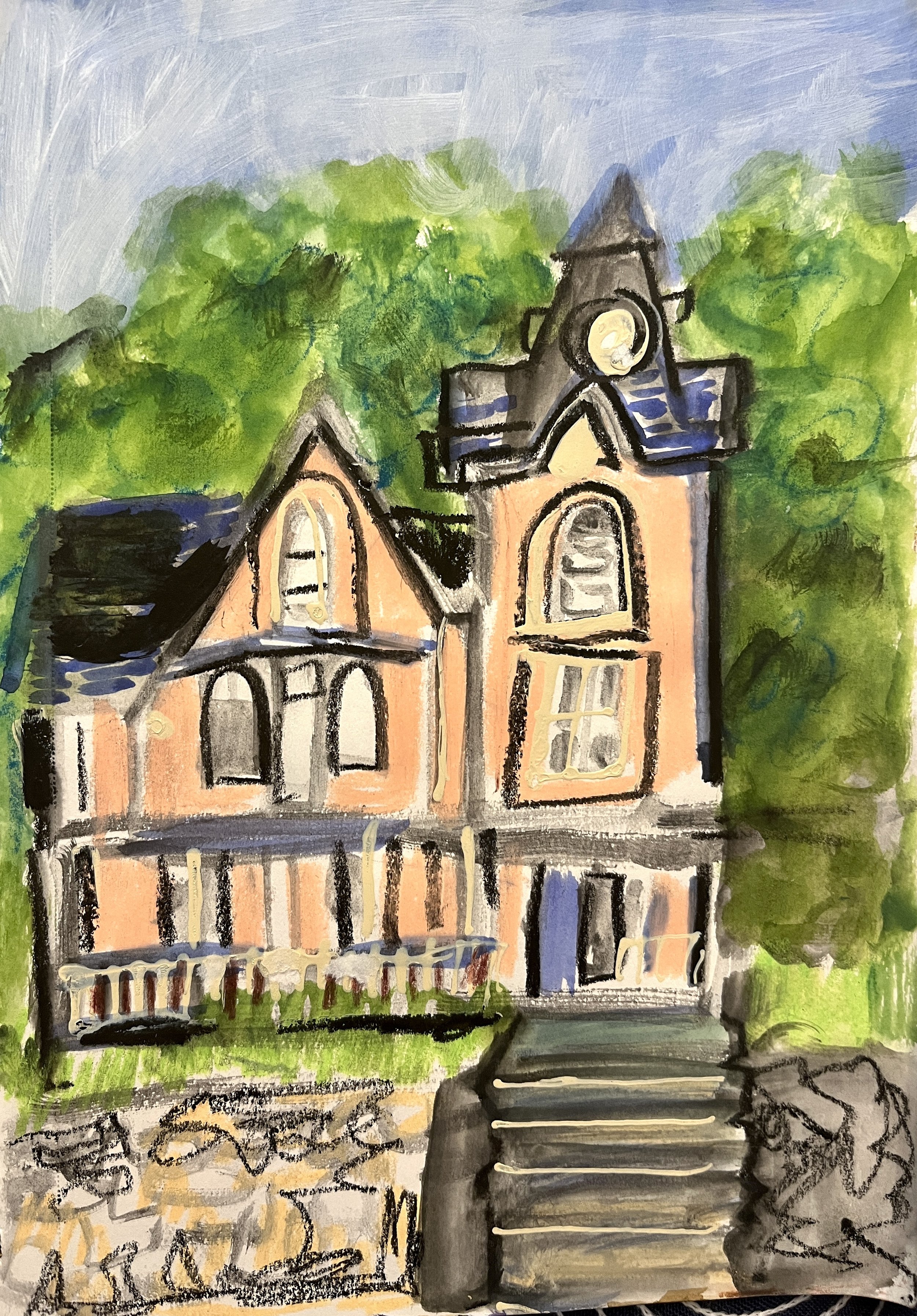
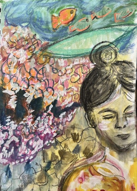
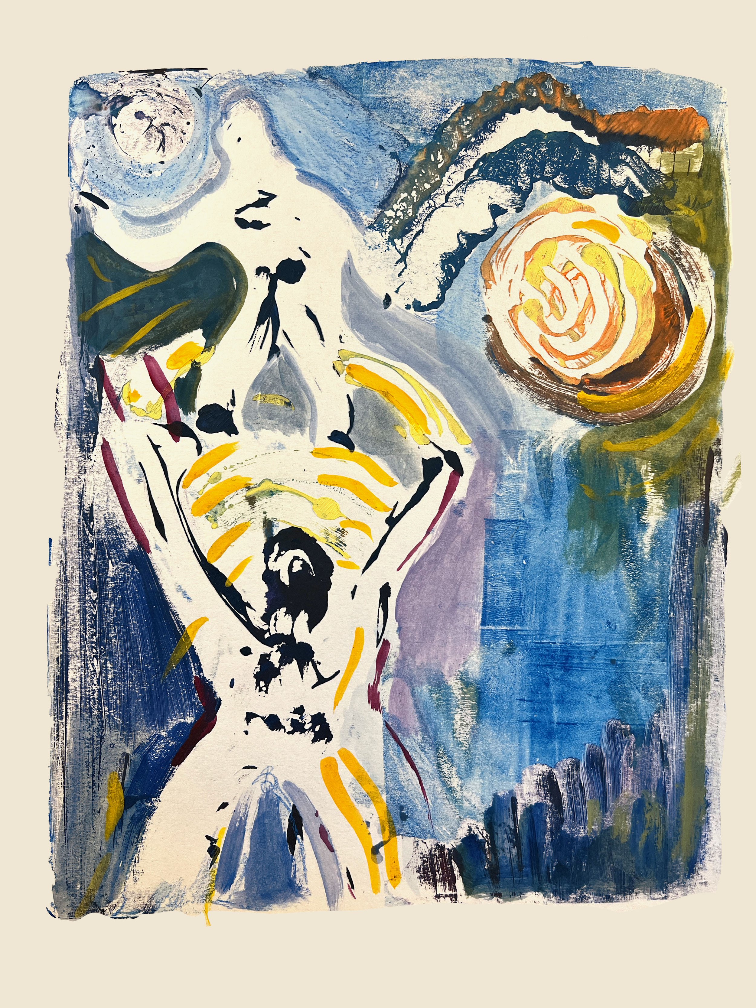
I’m especially excited about some sketchbook drawings I made at my local community pool, which saved my sanity daily this summer. This one has stuck in my mind for some reason, and I’ve started to develop it further.


3. Other Sketchbook Drawings and Drawing Sessions

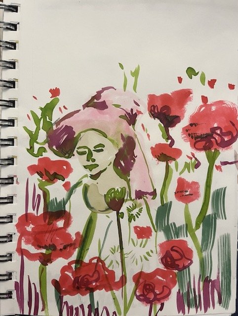
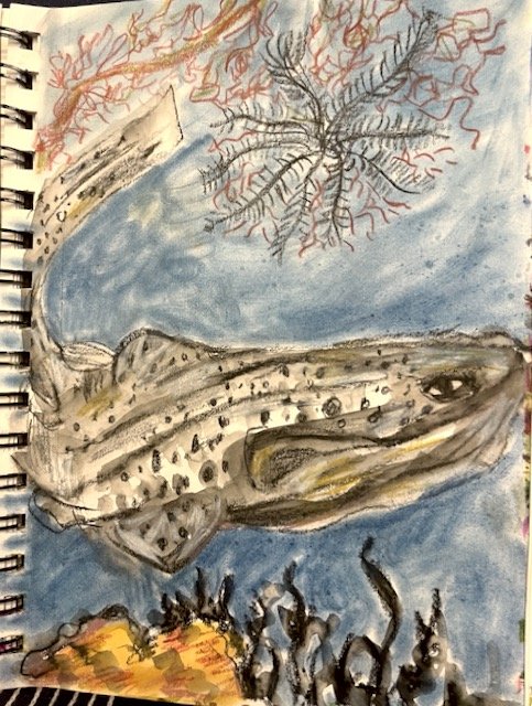
☀️ Drawing from National Geographic magazine is still a pleasure — a quarantine habit that’s stuck! (Sometimes I draw straight from an image, other times I combine freely.) I’ve noticed that my usual “horror vacuii” style is sometimes being joined by a few compositions with more white space. (Also the case the bathing suit sketch above.) This was a style I worked in more a few years ago and I wonder if it’s returning in some way — although obviously I’m still pretty good at packing a page.

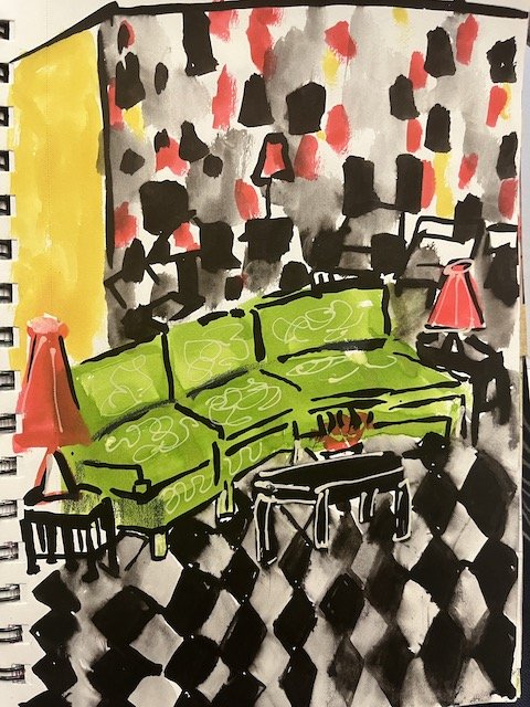
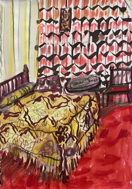
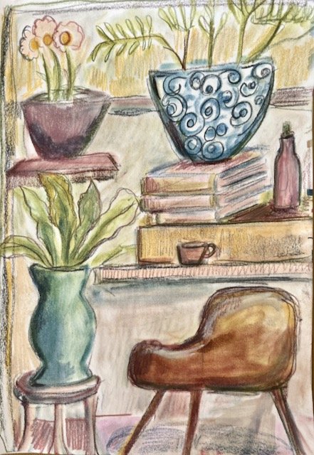
🌈 I also did a bunch of sketches of 1970s hotel interiors. These are from the heyday of the Poconos.

Although I know this makes me sooooo oooooooooold, the 70s were when I made my debut on this planet, and its design ethos is present in my blood. My memories are of course vague — In Kindergarten, I remember having a disco lunch box, and thinking that Jimmy Carter and Jiminiy Cricket were probably the same person!

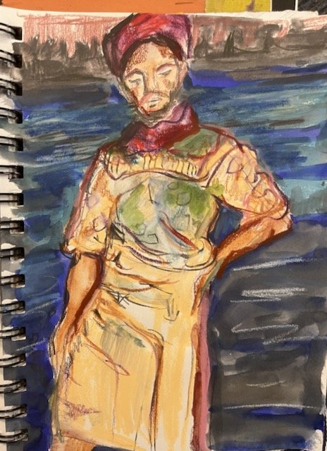
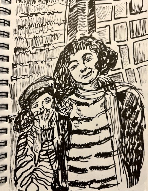
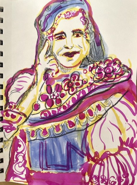
🙄 I read another biography of Marc Chagall, this one by Jackie Wullschlager. (Earlier this year, I’d read one by Jonathan Wilson.) My grandparents had a lithograph of his that I lived with for many years. I love his art and wanted very much to admire him as a person, but… “I felt disappointed i what a spoiled and petty shithead he was,” I wrote in my notes. I did admire Bella Chagall, though, so I made some drawings of her and her daughter Ida.


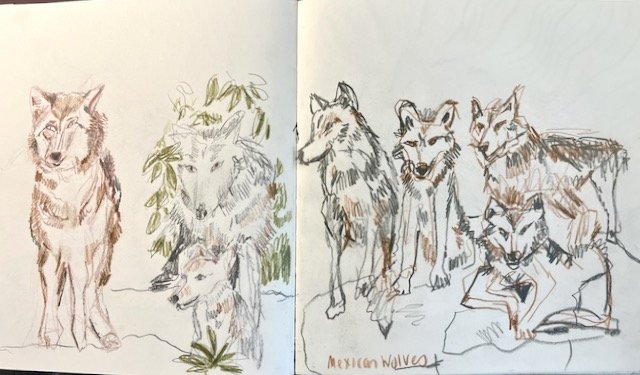
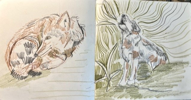
✅ Online drawing sessions: Holly Surplice’s Wonderful Wolves session replay entirely lived up to its name! Emma Carlisle and Sarah Dyer teamed up to draw cars, which I weirdly liked a lot. (I have a little internal cringe about car enthusiasm, due to it being an obsession of the ex-husband, but I actually do quite like the look of vintage cars…I’ve actually been drawing more of them since.) I also joined Beth Spencer’s Introvert Drawing Club, which could not be more perfect for me, the confirmed introvert. I’ll have more drawings from that next month.

Hi Embroidery!

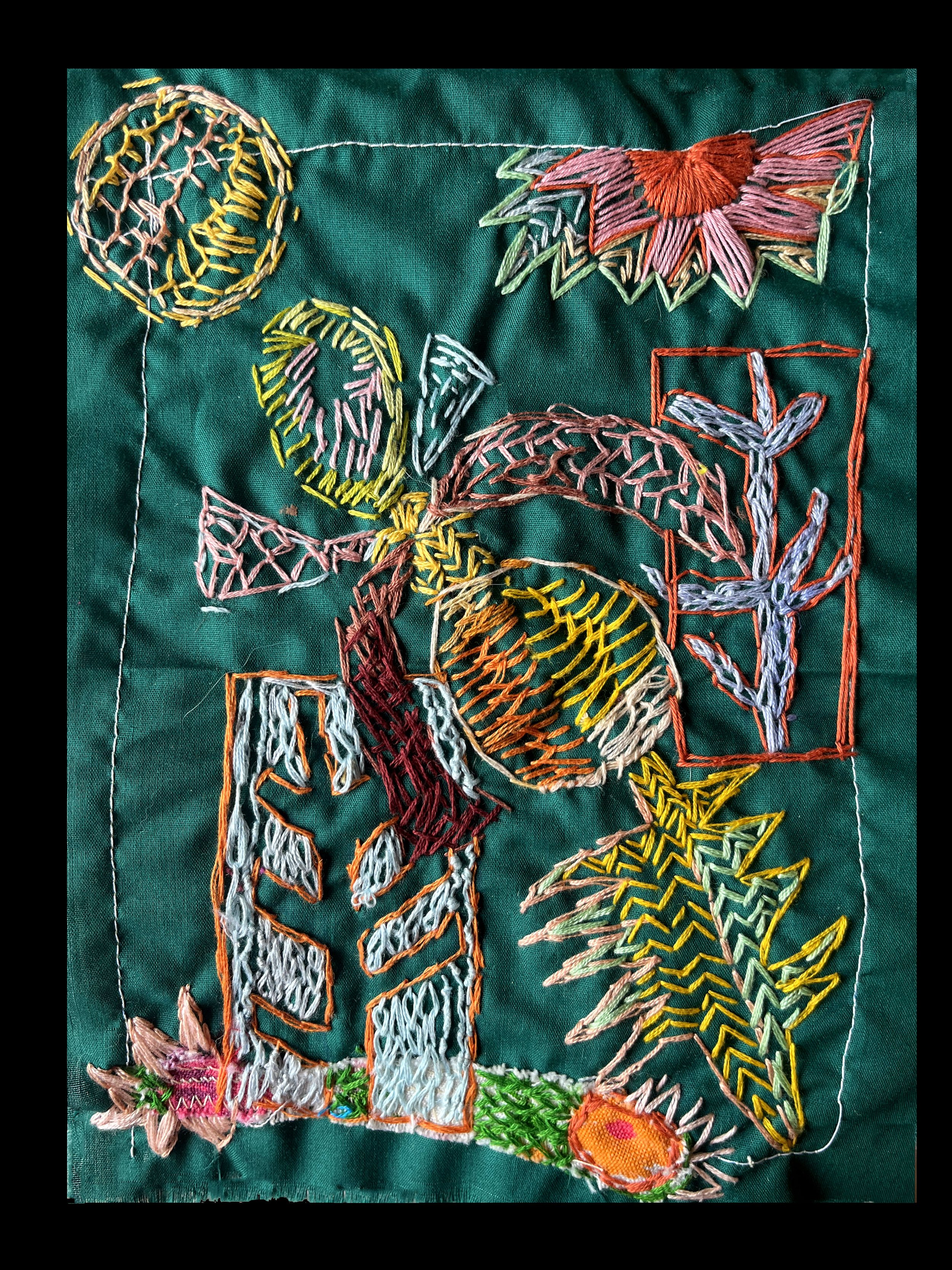
My fingers got itchy for the needle as I prepped my embroidery books for their star turn at The Art of The Book Show in Rochester, opening on September 18th. I’d been on a little break from embroidery, but I’m back, baby.

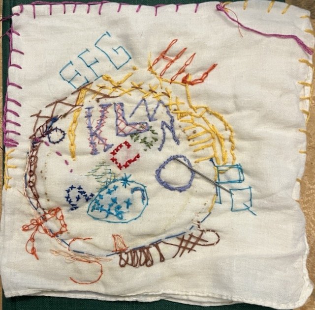
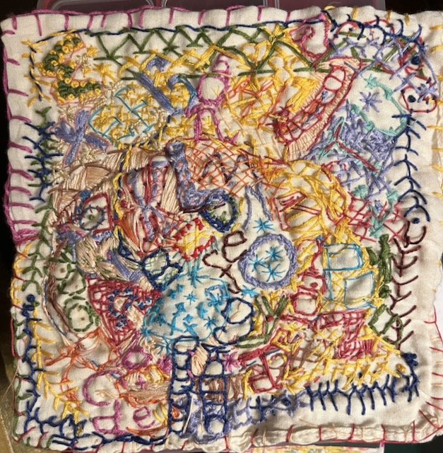
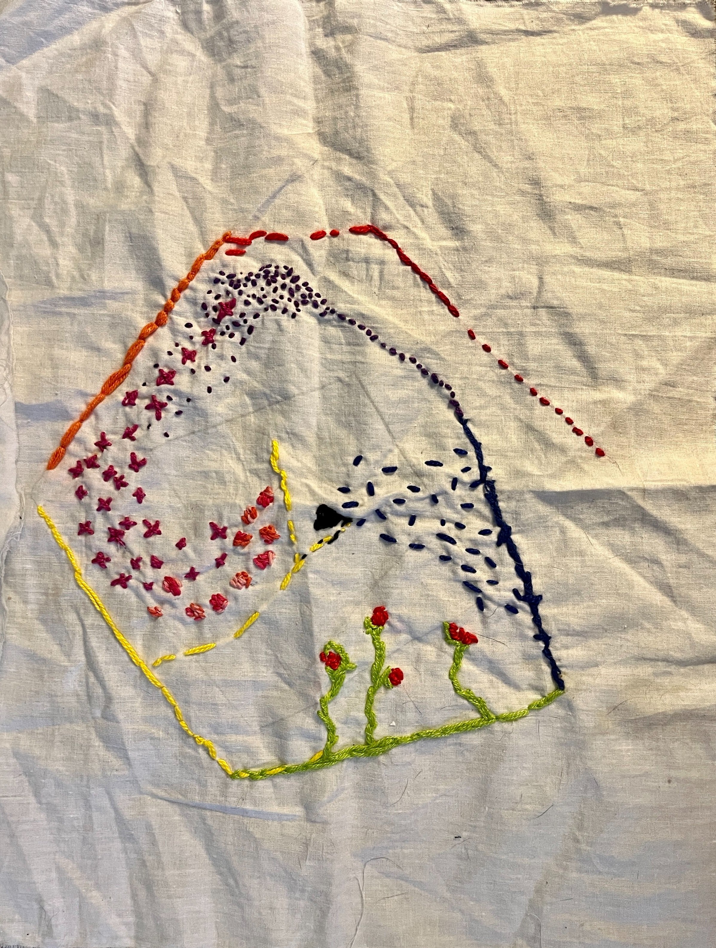
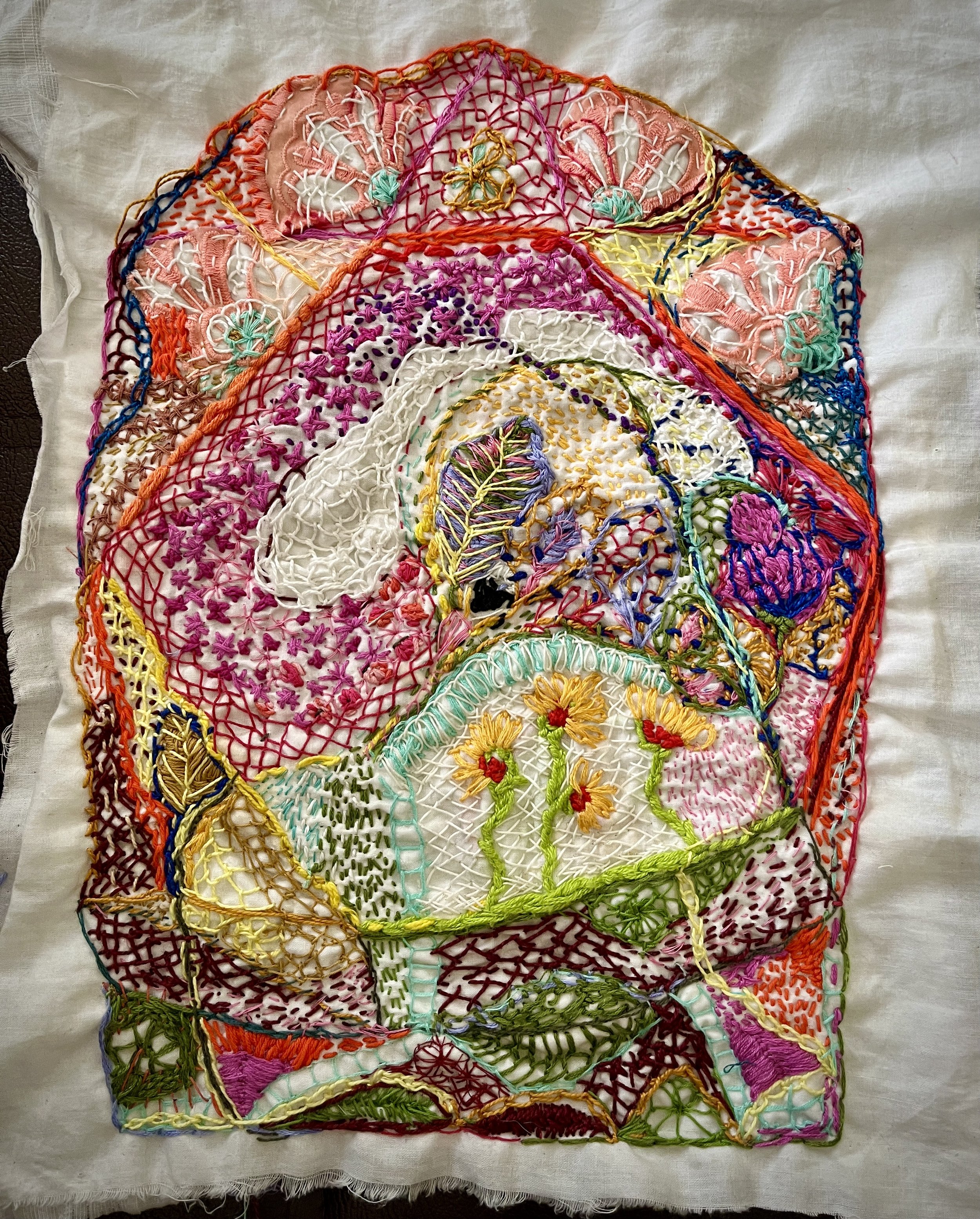
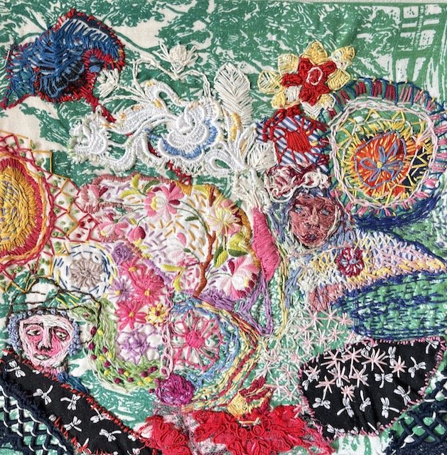
Here’s the ignoble first of my “Collaborations with Anonymous Project,” in which I use the incomplete embroidery project of a stranger as a prompt. I shared the second one here, the first one was kind of a mess because I went too far and then I kept going! I failed to take a photo of the first one before I started stitching, but the first one was taken before I’d done too much.

Hi Refillable Pens, and Bye Markers!

Note: I’m not adding links to common art supplies I’m mentioning, you know how to Google and I’m not doing affiliate links at the moment. As a matter of policy I’ll just add links to things that are in some way specific, or a little more tricky to find.

I made a real switch in my art materials. I’ve been feeling uncomfortable with non-refillable markers for a long time — for one thing, they are very expensive, and for another thing — just a lot of plastic in the trash.

This is the second time in my creative life that I’ve made this switch. Back in my full-time writing days, I was very particular about a certain Uni-Ball pen and bought boxes of them. At some point, I realized that I would be saving money and resources by using a refillable pen, which is when I got my Lamy fountain pen, a refillable cartridge, a syringe, and Noodler’s Ink, the very best ink.

Over the past few months, I’ve been slowly experimenting with filling water brush pens with liquid watercolor or ink, with the goal of replacing my Tombow brush markers.

It’s taken some trial and error and some very annoying and messy leaking, but I was able to finally put away my markers and go 100% refillable.

I found that Pentel Brush Pens are the only ones that don’t leak on me. In the brush pens, I use Ph. Martin Concentrated Radiant Water Color and some of their Bombay inks, Ecoline liquid water color, Noodler’s ink and some Winsor and Newton — I really like their Polar White. Michael’s Artist Loft liquid watercolors are also pretty good and very affordable! It’s really great to be able to mix the exact colors that I want.

To replace fine liners, a Sailor Fude pen with Noodler’s X_Feather Black Ink is the way to go. I also have a calligraphy nib on a long Lamy pen, which I use with Lamy’s gray ink, gorgeous.

I’m still experimenting with empty brushes and containers for acrylic paint, to replace my Poscas. Still not thrilled with this yet, but so far, some cheap refillable dauber bottles from Amazon filled with a mix of acrylic paint and water are doing the job.

In Conclusion!

I didn’t think that I’d gotten a lot done, but it was actually not a bad month now that I see it all in one place. So I guess I’ll keep these reviews going for now, since it makes me feel all productive.

P.S. Please forgive the imperfect photo editing and any typos…if I got uptight about it, this would never have been posted!
Collaborations with Anonymous #2

Since my favorite art supply is randomness, I’ve started an embroidery project wherein I “rescue” (purchase) incomplete embroideries from thrift shops and then take them to completion in my own way.

I should say this is far from my original idea. I’ve read about people doing things like this, most notably Shannon Downey’s “Rita’s Quilt” project.

So here’s the piece in its original form, and where I took it. The picture on the left was taken on July 22nd, and on the right, on August 23rd. (When I realized it was exactly a month of work, I tried to call it done because I do like date symmetry. But it needed some more the next morning, so alas.)

My project isn’t to try to suss out what the original embroiderer had in mind, but rather to use it as a jumping-off place.

To add a level of complexity, I’m using mostly fiber I’ve also purchased at reuse stores, thus also from abandoned projects. Full disclosure, I do supplement with my own stash, some of which was bought new! I like to use a variety of threads and textures — so the original embroidery was made in yarn, I’ve used silk thread, regular cotton embroidery thread, perle cotton and sashiko thread. I also threw a little applique in there — the fabric pieces were sourced from Fabscrap.


The Peacock and the Peahen Have a Big Night

Earlier this year, I saw a peacock unexpectedly. Yes, it was in a game preserve, but I also happened across the game preserve unexpectedly — that’s life in Pittsburgh for ya. I did a bunch of sketches on the spot, followed up with more when I got home, then did a wonderful animal life drawing session focusing on “fancy fowl.”

All of which I did with no idea of why I got so interested, or what I’d do with these studies.

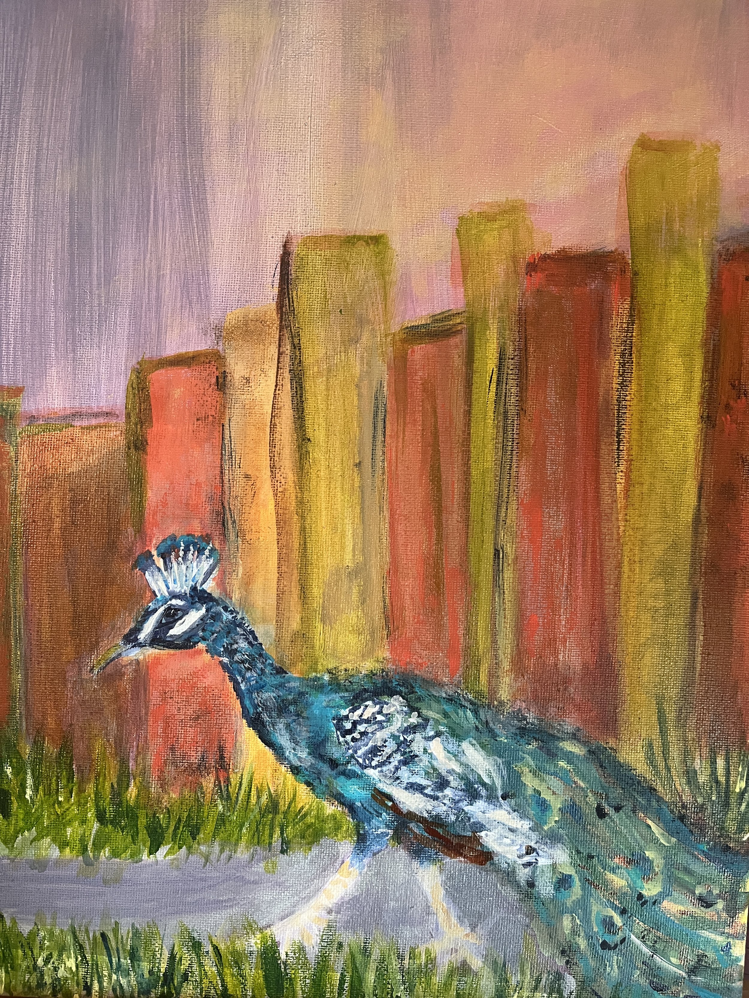
I ended up with this pair of paintings, both 11x14 inches, acrylic on canvas. Also the very first paintings I’ve completed in my new studio!

The peahen is stepping out for the evening, and the peacock is doing his walk of shame the next day. For the sake of their privacy, what happened in between is an ellipsis.

Keystone Crossings Sketchbook

This year it feels like I have spent most of my time driving between New York City and Pittsburgh.

Elder caregiving responsibilities settled squarely and solely on my shoulders unexpectedly in mid-March, necessitating these 600 mile + round trips.

Altoona, PA. Branches that grow vertically like this are called “water sprouts”; they’re a sign of distress.

Other countries have social safety nets, the United States has women.” I think about this quote often on these trips, as the mileage adds up to a couple of Continental crossings.

The first few trips were so fueled adrenaline and panic that that I had little time to notice anything extraneous. But as the crisis phase resolved into tedious difficulty, I began to think about how to make this long drive less taxing.

There is just so much Pennsylvania, each and every time!

One plus is that the landscape changes quite a lot along the way. The state is geologically so varied, formed by the distinct influences of the rivers Ohio and Susquehanna. Further East geological forces give way to the sociological influence I think of as New Jersey.

After a few drives of just contemplating this landscape while listening to audiobooks and podcasts, I thought, now wait a minute. I’m an artist and here is a big new-to-me subject.

So I decided to plot sketching stops a long the way.

Stopping every couple of hours to walk around and draw a bit helps so much, with the physical and mental fatigue. The trip takes longer but at least I’m not arriving already depleted.

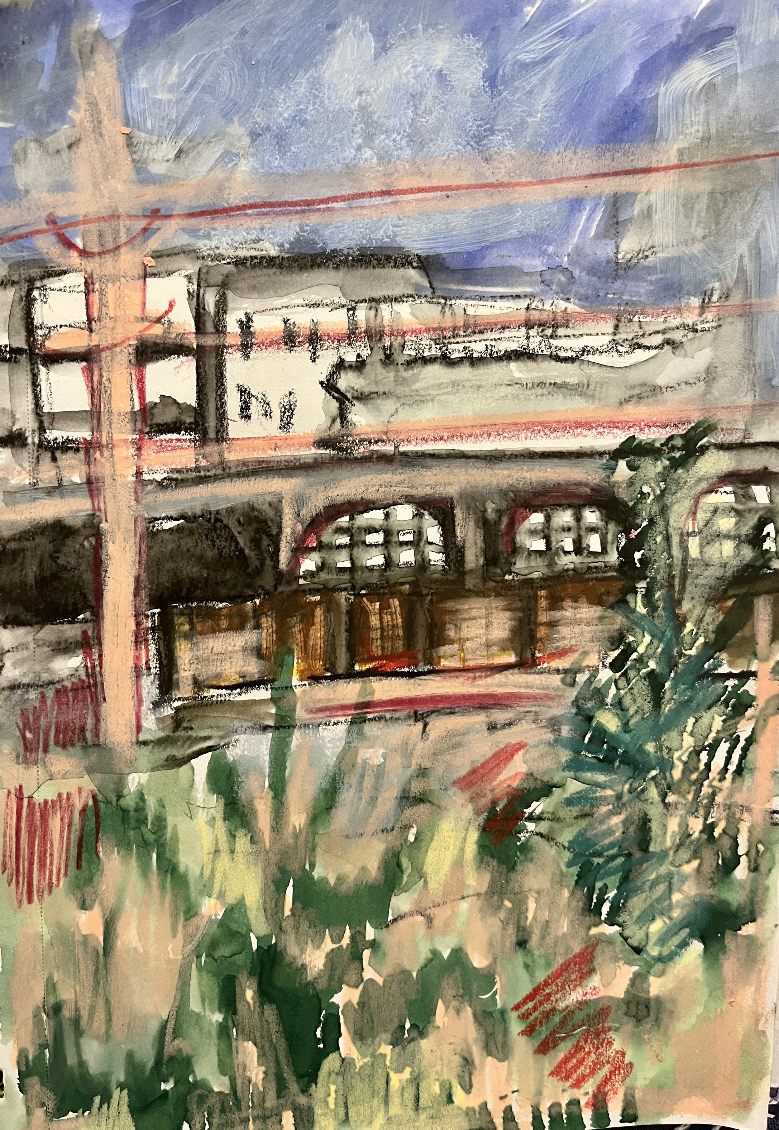
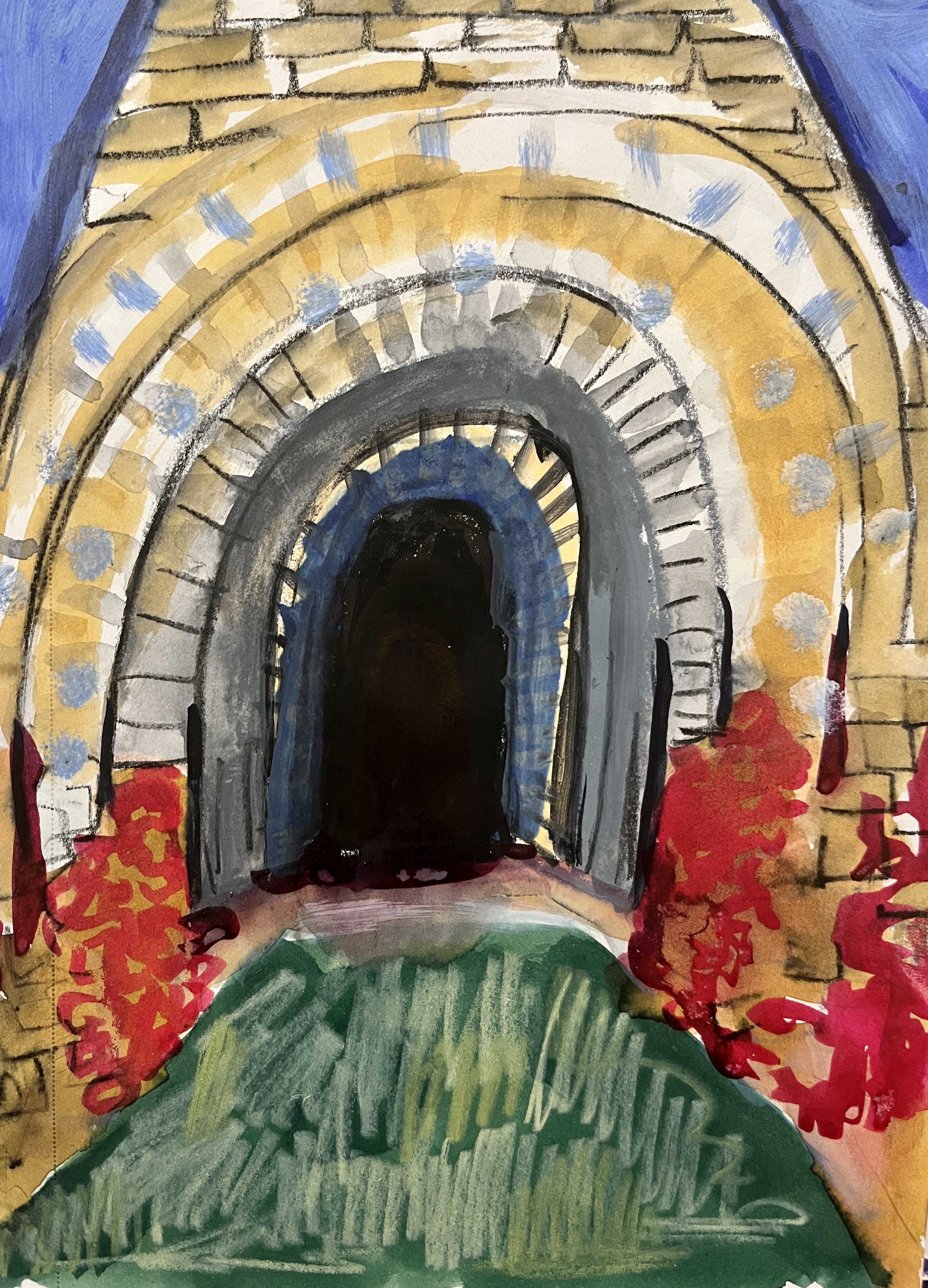
On my last trip, I stopped in Scranton and checked out the Iron Furnaces. I’ve mentally bookmarked this place as an excellent teaching venue for extreme perspective. I have a few more sketches in the purse notebook from this stop that still need developing, it was such a cool place to draw. (In case it’s not obvious, I did not do naturalistic color in this work.)

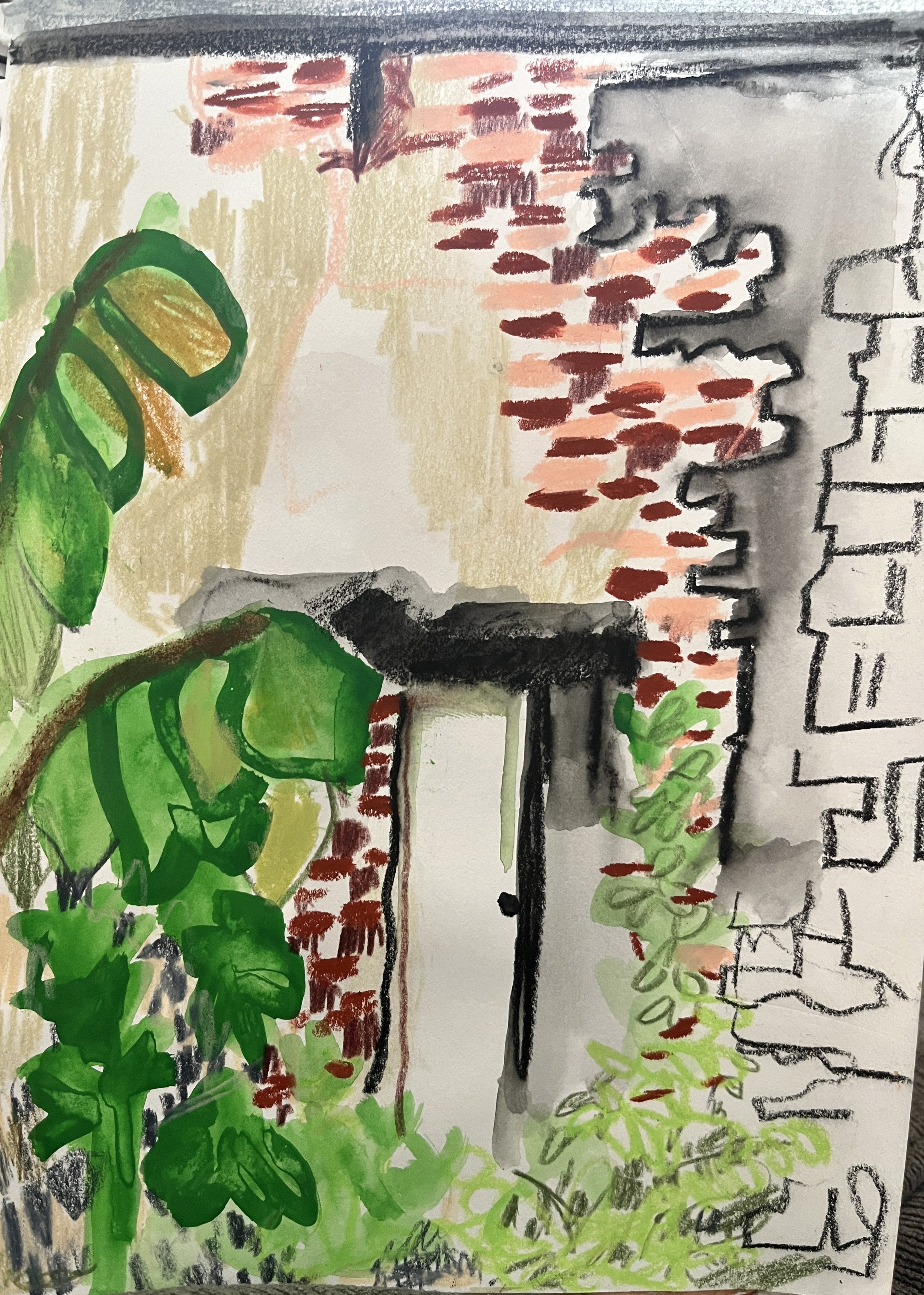
I also stopped in Altoona. I’d never been before, so I just drove around and sketched what caught my eye.

I also stopped in Bloomsbury, but I haven’t moved those sketches out of the purse notebook phase yet. The weather wasn’t great, so I hung out in a coffee house. (Fog & Flame, recommended!) I like doing coffee house drawings, but at this point I don’t consider them place-specific.

I did plan drawing stops on the way back, but that didn’t work out as well. I wasn’t able to focus on drawing at all; I was just so flat exhausted. When I stopped I just stretched my legs, replenished my caffeine blood levels, and did nothing more than dumbly glance at my sketchbook in my purse as I climbed back into the car. Nothing was more compelling than getting home.

So next time I’ll hit the places I skipped— lookin’ at you Allentown, Harrisburg, Johnstown! I’ll share as I go along, and as I develop more work from these sketches.

Monthly Studio Review #1

What’s this? See programming note below.

1. Excursion: Boyce Mayview Park

One thing that continuously surprises me about the Pittsburgh area is how HUGE the parks are. The first park I went to had a wildlife preserve, including peacocks and bison. Bison! I knew I’d moved west, but that was (delightfully) ridiculous.

Anyway, Boyce Mayview Park, in Upper St. Clair, does not have bison as far as I know, but it is also enormous— just under 500 acres. So when I saw it on the map and decided to just pop by on my way from running an errand, I was not at all prepared for, like, unmitigated nature. Nevertheless, I did go for a short hike and sketch sesh.

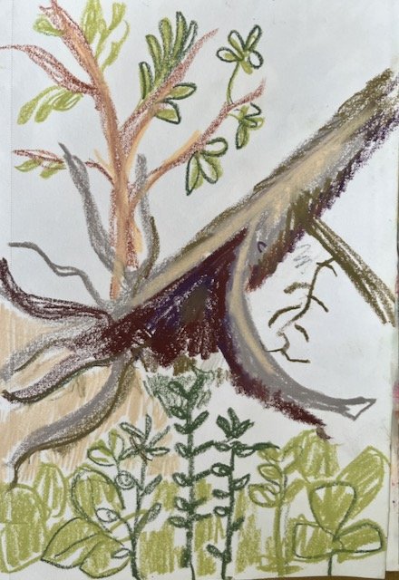
This was where I started to notice that white space is returning to some of my compositions. I do love horror vacui — I tend to think if your eye needs to rest you can just look away from my art, thank you very much. And yet, negative space isn’t just blank, and can be very beautiful also.

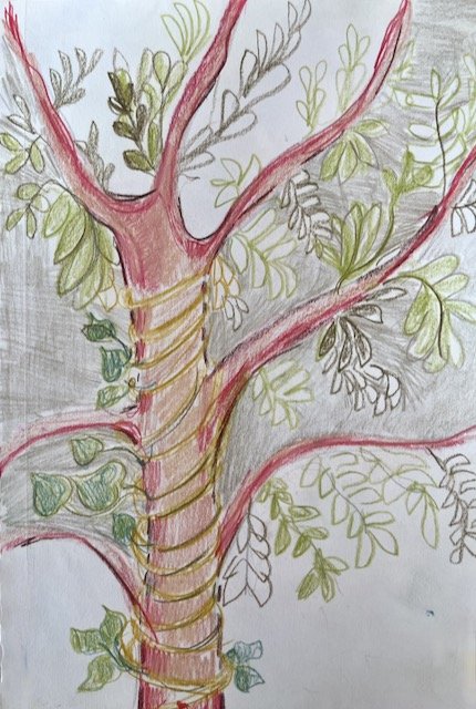
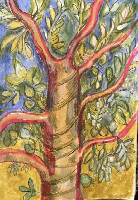
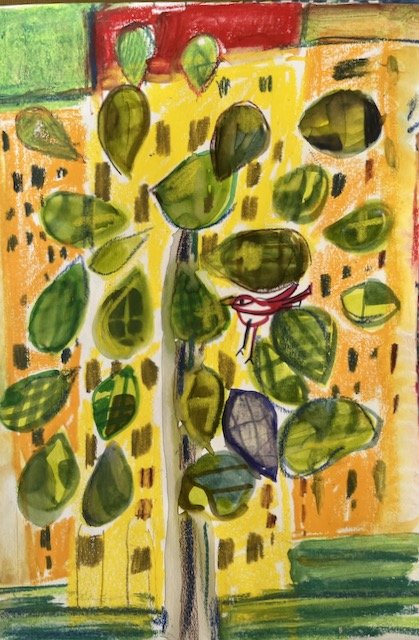
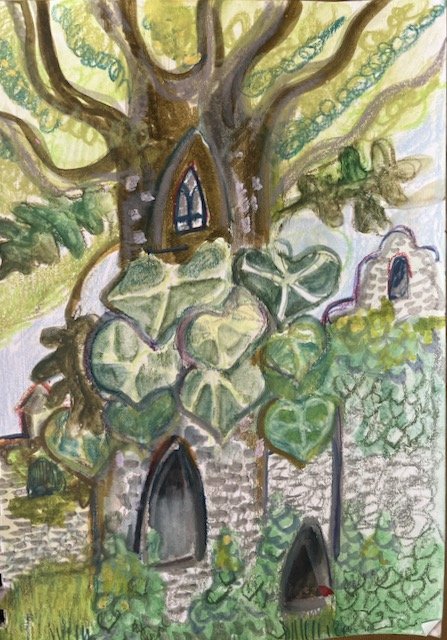
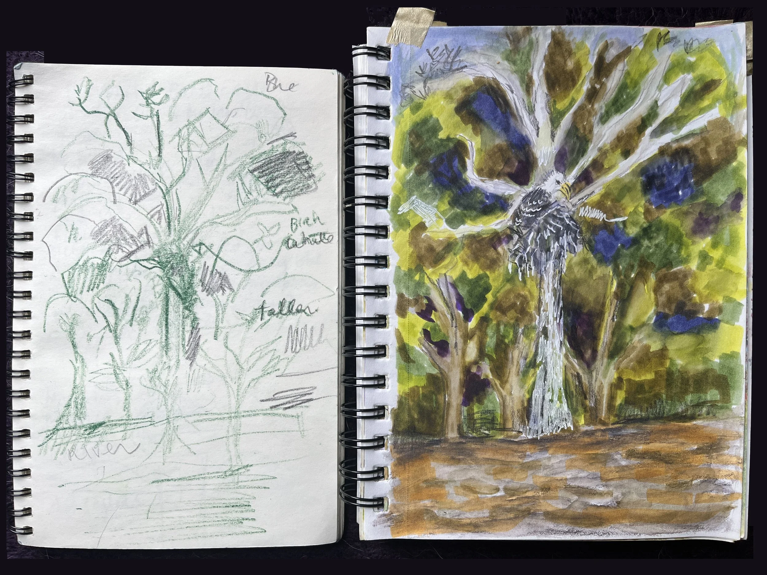
I sketched a lot of fallen down trees (tree falls?) but the drawing I’ve ended up developing so far was of a tree covered in a vine.

2. Artist Inspiration: Hundertwasser

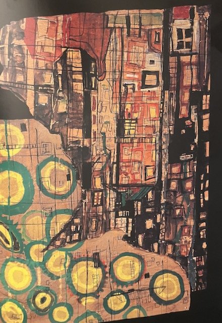
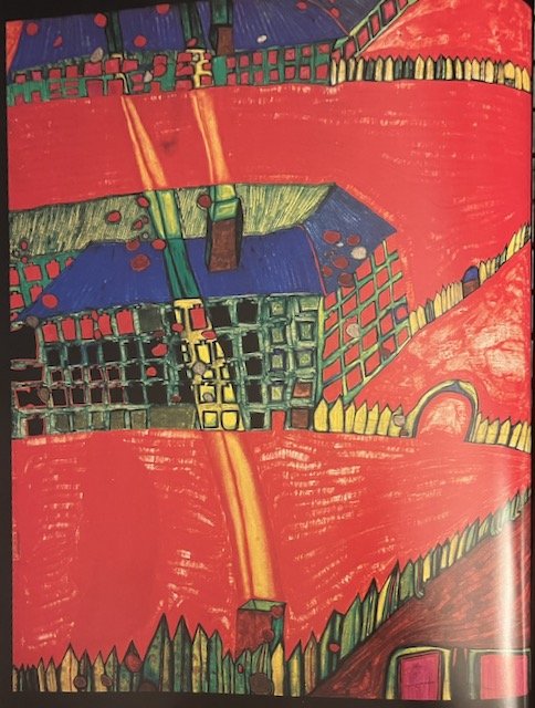
My beloved therapist told me about the Austrian artist Hundertwasser after she saw my Forsythias piece. I’d never heard of him, so I promptly relieved the library of two amazing books on the artist, one by Harry Rand, and the other by Weiland Schmied.

As is unfortunately so often the case, while I was very taken by his work, I was kind of appalled by his behavior. While he is certainly not the worst in comparison to other male artists of his time, that’s a low bar. In fairness, he struck me as more annoying than awful. BUT I do still really love this work:

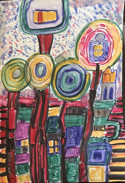
When I love an artist, I copy a couple of their works into my sketchbook. It’s the best way to really do a close observation — it’s called a “study” for a reason! These aren’t meant to be faithful reproductions — that’s not important to me at all. But I learned a lot from doing these two:

I see some of Hundertwasser’s influence in this drawing I did a couple of weeks later.

3. More Inspiration: Poetry

The bulk of my attention this month was on doing drawings and paintings inspired by poems and literature. This came from a development of an exercise taught by Sarah Dyer in her excellent Patreon. I don’t want to describe the process too much — go subscribe if you’re intrigued — but it involves making a a simple folded book, in order to find unusual compositions. (Of course because I like making books and know a few other folded book forms, I took the general idea and went off in my own direction.)

I got a little obsessed by this process, and ended up with about 10 compositions I wanted to develop further. I’m not sharing too many of these right now — more next month.

Here’s one example of a composition I really like that I derived from this process, inspired by a gorgeous poem by Craig Santos Perez.

Here’s another example — the “book” page is on the left, and the first drawing I did is on the right. (This was inspired by the poem by Sandra Simonds.)

4. Ongoing/Misc.

  • I continue to draw in coffee houses and cafes, my natural habitat. I found an idea from Sandi Hester very liberating — she draws elements from an observed scene and just place them where she feels like it/makes her own composition. My journalism background makes that feel very naughty, but of course that’s totally fine! And it makes drawing in coffee houses much more interesting.

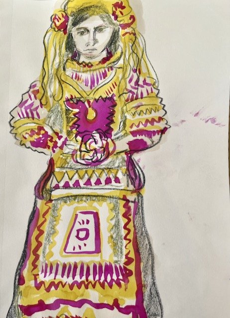
  • I made my first excursion to the main branch of the Pittsburgh public library. It’s lovely, and grand in proportion to the size of this city. (It’s not fair to compare it to the NYPL’s main branch, so I won’t, except to say this: it’s smaller, of course, but definitely more user friendly.) I found a book about embroidery techniques from around the world and of course went wild drawing from it. A couple of Greek brides above.

Programming Note: Every creative person I know struggles with how much to make public, what to keep private. I always feel like I struggle more than most with this, but I probably don’t.

I DO want to share what happens in my studio, but there’s also a need to keep things contained for a while, so I can let them develop without positioning them for public consumption. Even though I have a fairly low profile, and even though I’m sharing mostly visual work and not words, the simple act of sharing and describing fixes it into place, in a way I’ve found intensely vulnerable and sometimes creatively destructive.

My answer, until now, has been basically just not to share anything until it was so far in the rearview that I had no real feelings about it anymore. I realize, however, that this does my art and my art career no favors.

At the end of June, I decided to do an experiment — I went over all that I did in my studio, made notes, took photos. My idea was that I would share it when the time is right. Does it really matter whether I’m sharing a studio update from the month that just finished, or a month or two previous to that? I don’t think so.

So while I just completed my private July studio review, this month I’m reporting on, on August 1st, is actually what happened in June. If this feels good to me, I’ll keep it going.

Also: the photos aren’t perfectly edited and there may be typos. What can I tell you? I’m a human with only so much time in the day. :)

Sweet Emotion [Art Journal Pages]

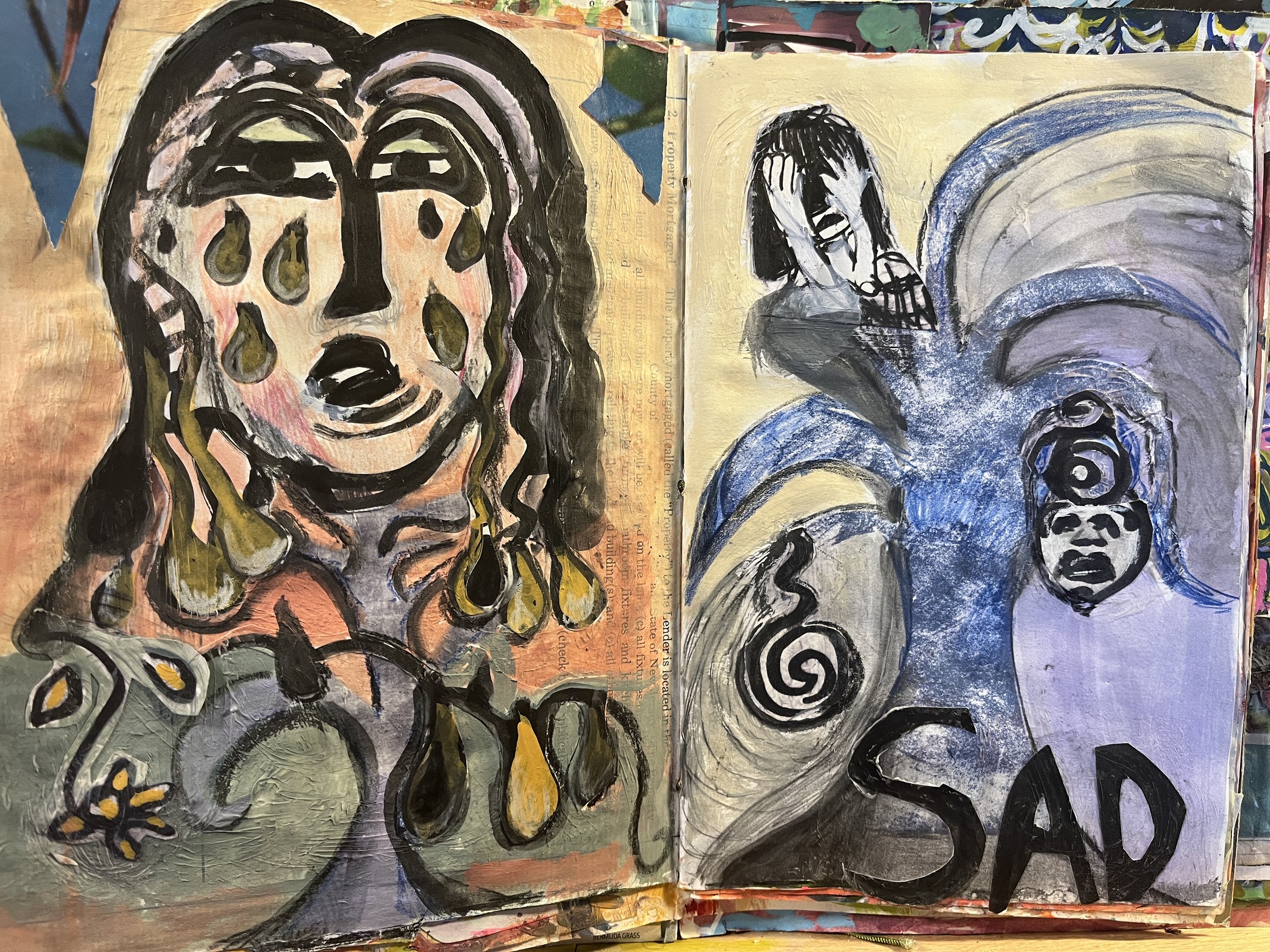
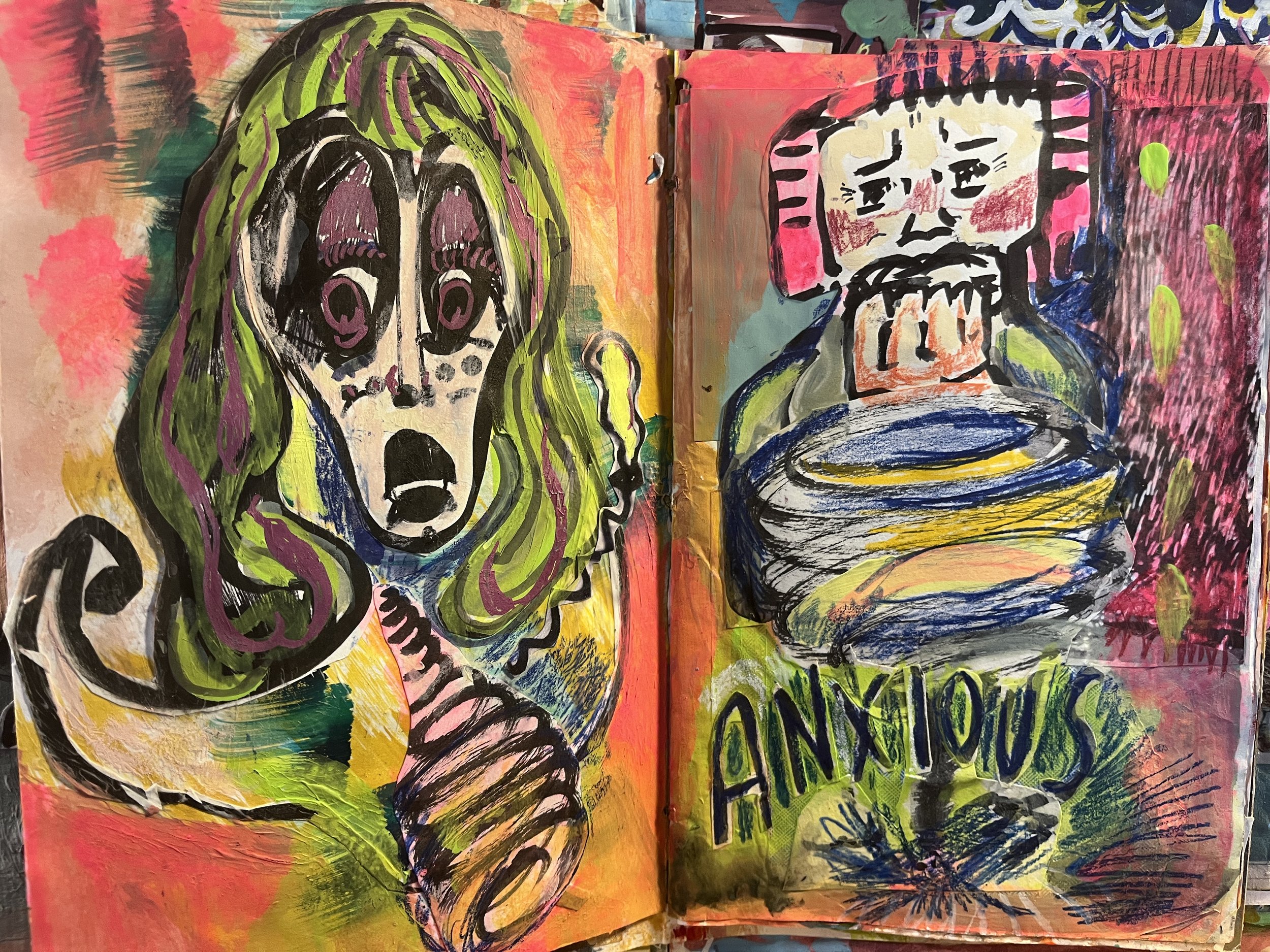
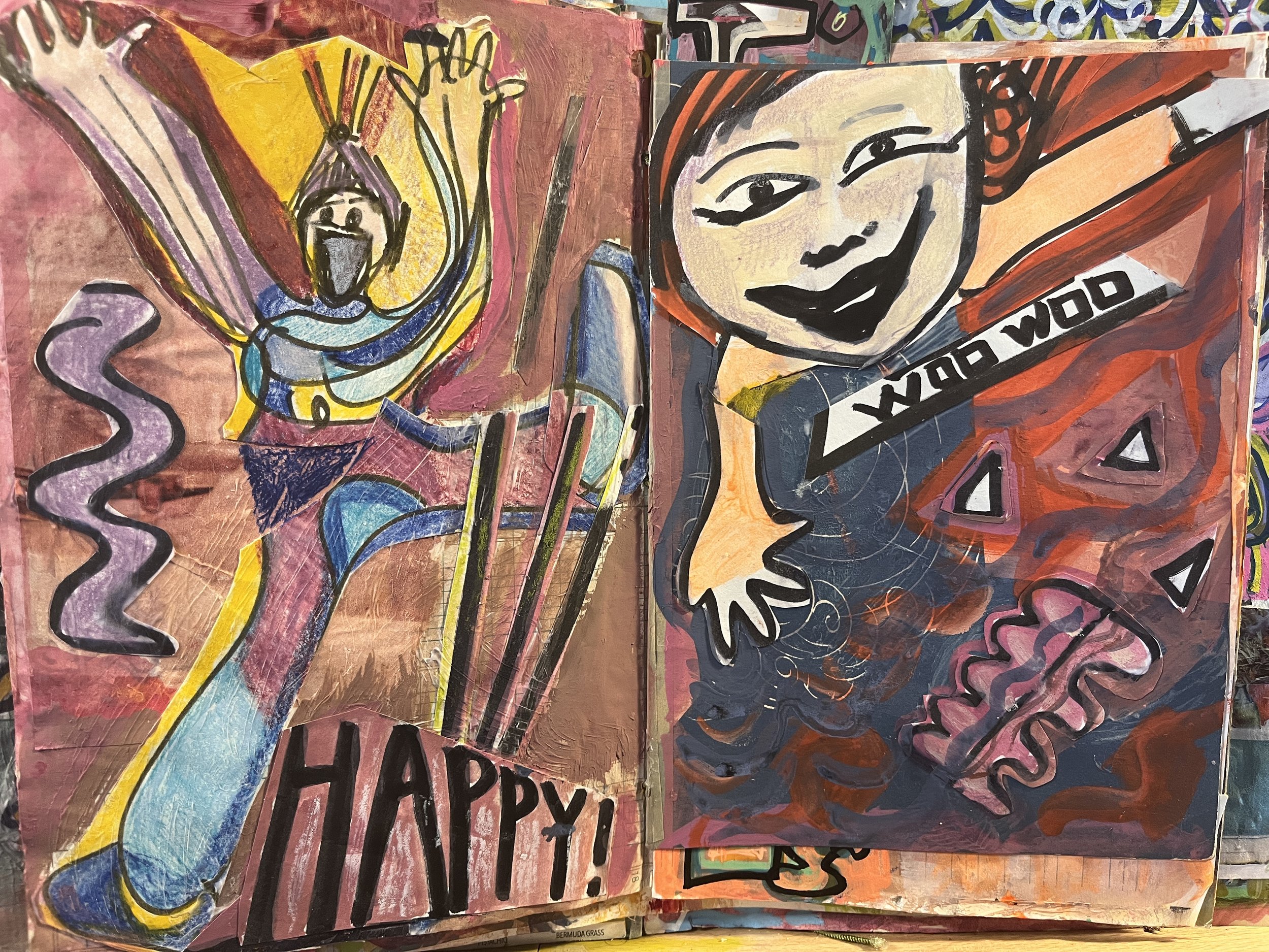
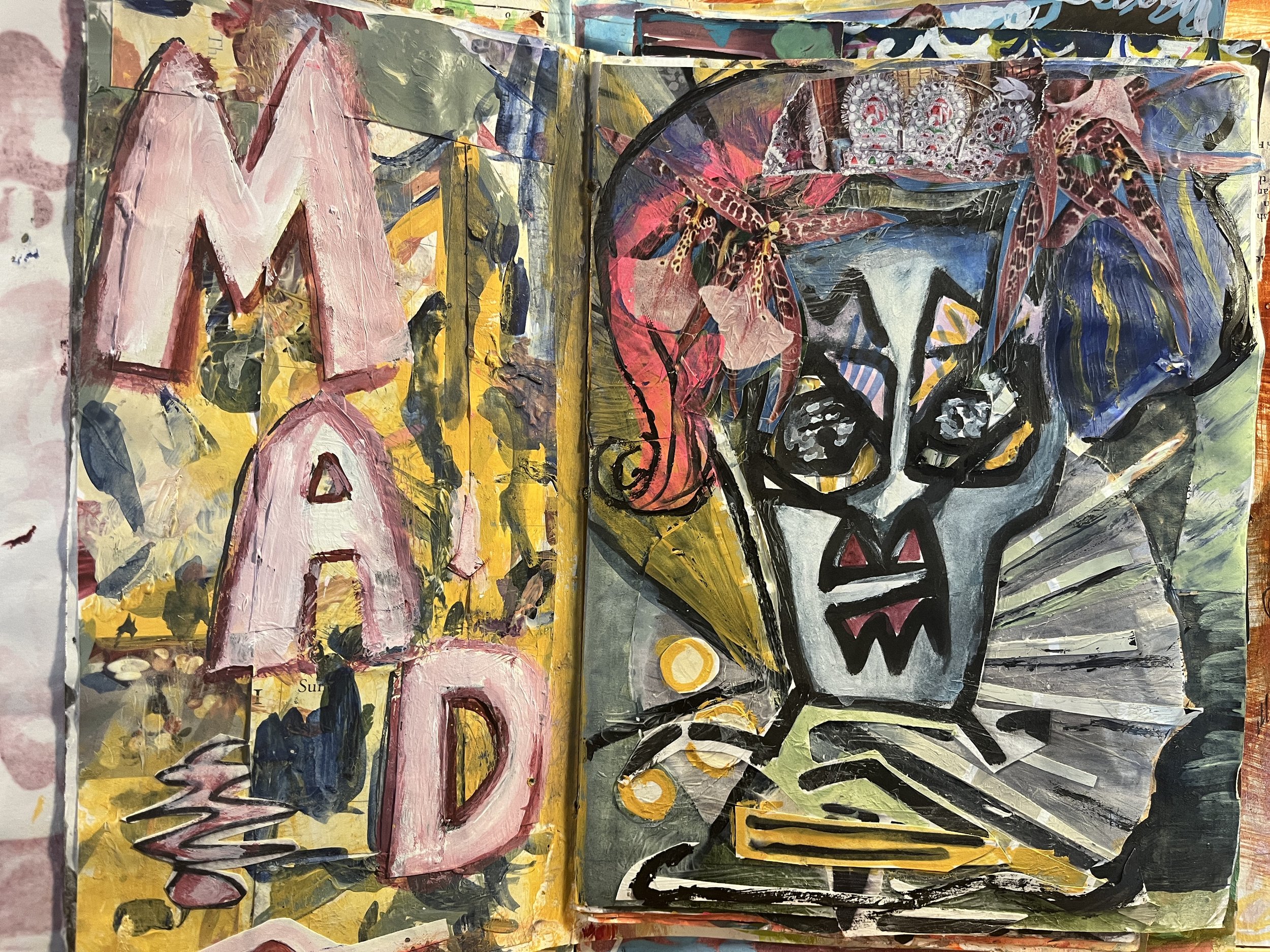
Not long ago, I did this series in my art journal, exploring different emotional states, “Mad” was my first and favorite, “happy” was my second favorite and the last one I did, make of that what you will.

[ I feel duty-bound to disclaim that these are not edited photos. The colors are a little off. These are handbound journals with pages of various sizes so other pages are visible around the edges. But if I spend loads of time editing these, I’ll never share them! So now you know. ]

Carnegie Arts Walk 2023

Carnegie is often described as a ‘vibrant arts community,” and this, plus the library, plus the dog park, is why we chose it! When I went to drop off my work for this show, I was blown away by the tiny glimpse I got of some other work that was selected for the show. I can’t wait to see it next weekend!
Here are the five pieces that I’ll have in this show:

The Return of the Purse Notebook

The purse notebook notebook is back, baby! Which means the pandemic, for me, is probably at its official end.
Until Covid, I always had some kind of a notebook with me. I also never left the house without some sort of a purse or a bag. I didn’t think that was optional. But like so many things, it turned out it entirely was!

During the pandemic, I didn’t use any kind of a bag or purse. (Phone, keys all fit in pockets, as would an extra mask.) I stopped thinking about sketchbook portability entirely because there was nowhere to “port.” And since I needed to be extra cautious, this went on for quite a while as we ticked through the Greek alphabet.

The notebook I’d take with me on outings also fit in a pocket. These outings were rare: it took three years to fill it. Prior to the pandemic, it would take about three months to fill a purse notebook, less than that if I was traveling a lot, which I often did.

But now I’m back to normal usage. I just finished one I started in May, which in its novelty made me reflective. So a few thoughts here, in case they are useful for you and your creative practice:

  • The purse notebook is different from what I consider my “regular” sketchbooks, which I sometimes have with me but not always.

  • It’s more like the reporter’s notebook I carried as a journalist. I am literally making notes, in the sense it was derived from, “to mark”. Very quick and dirty sketches, with descriptions of color (since I do not usually carry more than a pen and pencil.) Perhaps because of my writing background, I find it more useful to describe colors rather than to capture them on the fly. (I want to capture tonal differences, lights and darks, which can work for any color.) You may not know exactly what I mean by “lipstick red,” but I do!

  • I like to make a “real drawing” from my purse notebook sketches right away — ideally that night, but soon, while the image exists freshly in my mind’s eye. This is also similar to taking notes as a writer — fleshing them out as soon as possible always yields richer notes. These drawings are made in my “real” sketchbooks or art journals. Perhaps eventually to become paintings or embroideries or something else.

  • If that’s not possible, I’ll make extra notes in the purse sketchbook about what I saw to aid in the later drawing.

Here’s an example from my just-completed purse notebook, on the left, a moment in the delightfully named Big Rock Park, in New Brighton, PA. And a more developed drawing in my sketchbook made later.

Although I have often shown my sketchbooks and art journals, until this moment I have never considered showing anything from the purse sketchbook— mostly because unless I’m being meta like this, there is nothing for anyone but me to see. (I say mostly because occasionally I do make a nice drawing — if I’m stuck somewhere for a while or something. But it’s not the goal and it’s the exception.)

A related point. I’ve recently stopped taking photos of what I’m drawing in the purse sketchbook. At the moment realism isn’t very interesting to me, I’d rather rely on my sketches to make work.

Personally, I’ve found that drawings I make from photos I take are less interesting than those I make from observation. No judgement here — plenty of amazing work is based on photo reference. and I often use them in other circumstances. This is one of those tiresome debates in arty circles (to use photo reference or not) that rise to the level of moral conviction, and I am not taking a side because I’m on both.

Recent Work in 2023 Shows

I’m happy to say that some of my recent, never before displayed work is being exhibited this summer! Also pleased to get more eyes on a piece that was only exhibited online during the pandemic.

So here’s the work I’m showing this summer. if you’d like to purchase any of these, please contact the galleries directly! In breaking news, I just learned that my embroidered books, below, were juried into the international Art of the Book show in Rochester, NY this Fall. More to follow as the show approaches.

Cut and Paste: At the Irma Freedman Center for the Imagination, Pittsburgh, PA.

Through July 7th, 2023.

Forsythia. H: 9 inches W: 12 inches. Acrylic painted elements collaged onto paper with machine sewing. For the show, I framed this in floating glass, so there are gorgeous red threads floating down below the collage.

This piece was the culmination of many years of watching forsythia bloom in early spring, on the corner of West Houston and LaGuardia Place in Manhattan. I made many previous attempts to capture the feeling of it, but I think this is the one that did it for me.

“Absence/Presence”: 12 inches square. Monotypes collaged onto paper. I wrote about this piece here.

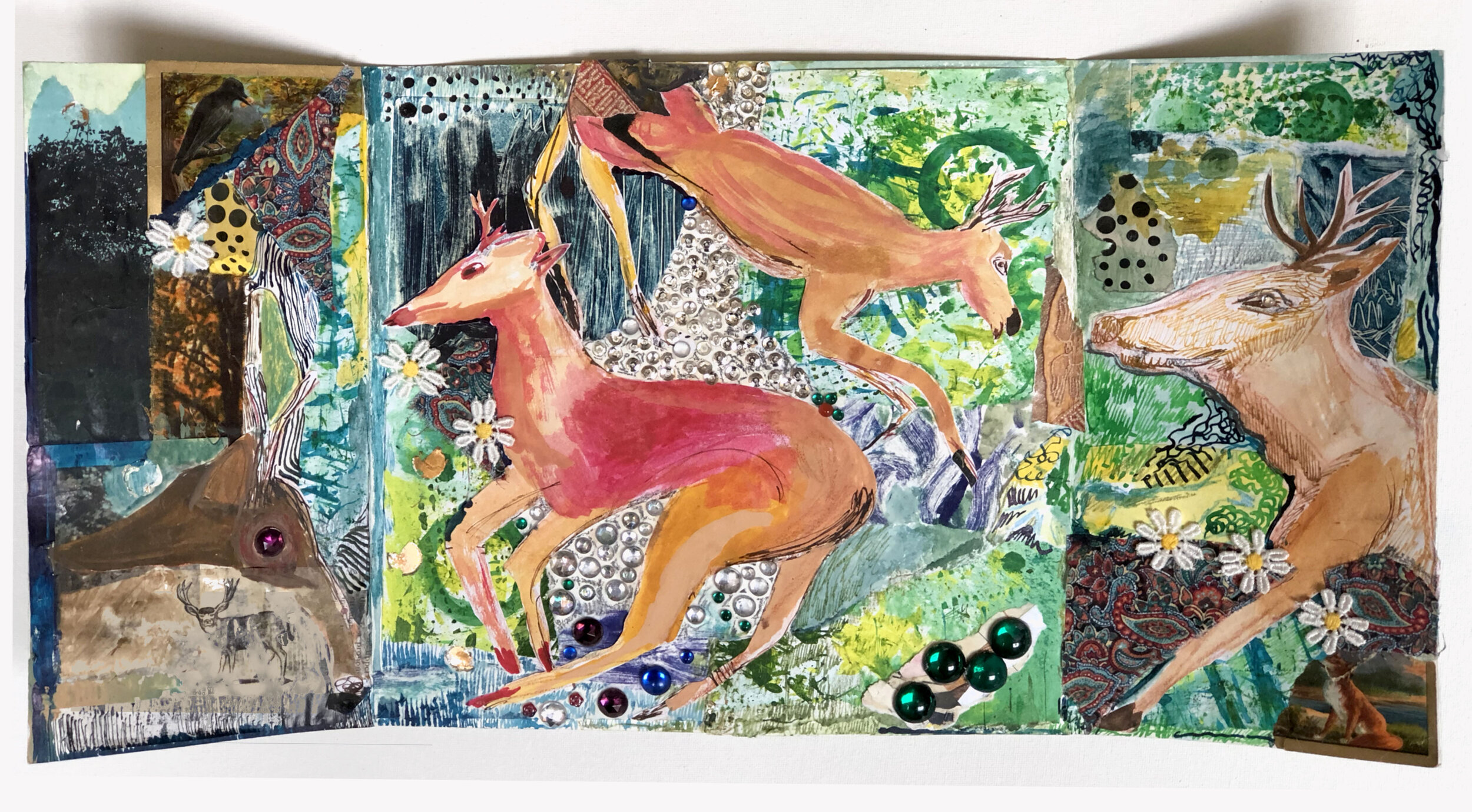
“Deer Dreaming” - H: 10 inch, W:20 inch. This is a gate-fold triptych, acrylic paint, watercolor, fabric, sequins and gems. I chose a floating glass frame for this one too, and I realize I’m biased but — it looks most beautiful! Here’s an Instagram post which shows the art journal spread which inspired this piece, back when I was [more] involved in social media. :) This piece was previously exhibited in Raices Taller’s Art of Paper show in late 2021.


[a]Mending Culture, at Ketchup City Creative, Pittsburgh PA.

Fiesta Flora, 10 x 10 inches. Embroidery and applique on vintage handkerchief, mounted on canvas. I wrote about the inspiration behind this piece here.

Our Town Newspaper Story on Embroidered Journals!

Fun!

For those who love books as art–or books and art–a visual and tactile treat awaits as Greenwich Village-based artist Alison J. Stein works feverishly to stitch, snip and appliqué a growing stack of delightfully-designed booklets that will eventually be exhibited as books without paper.

Local Artist Alison J. Stein Prepares to Unveil New Works: Embroidery Books Our Town, January 30th, 2023.

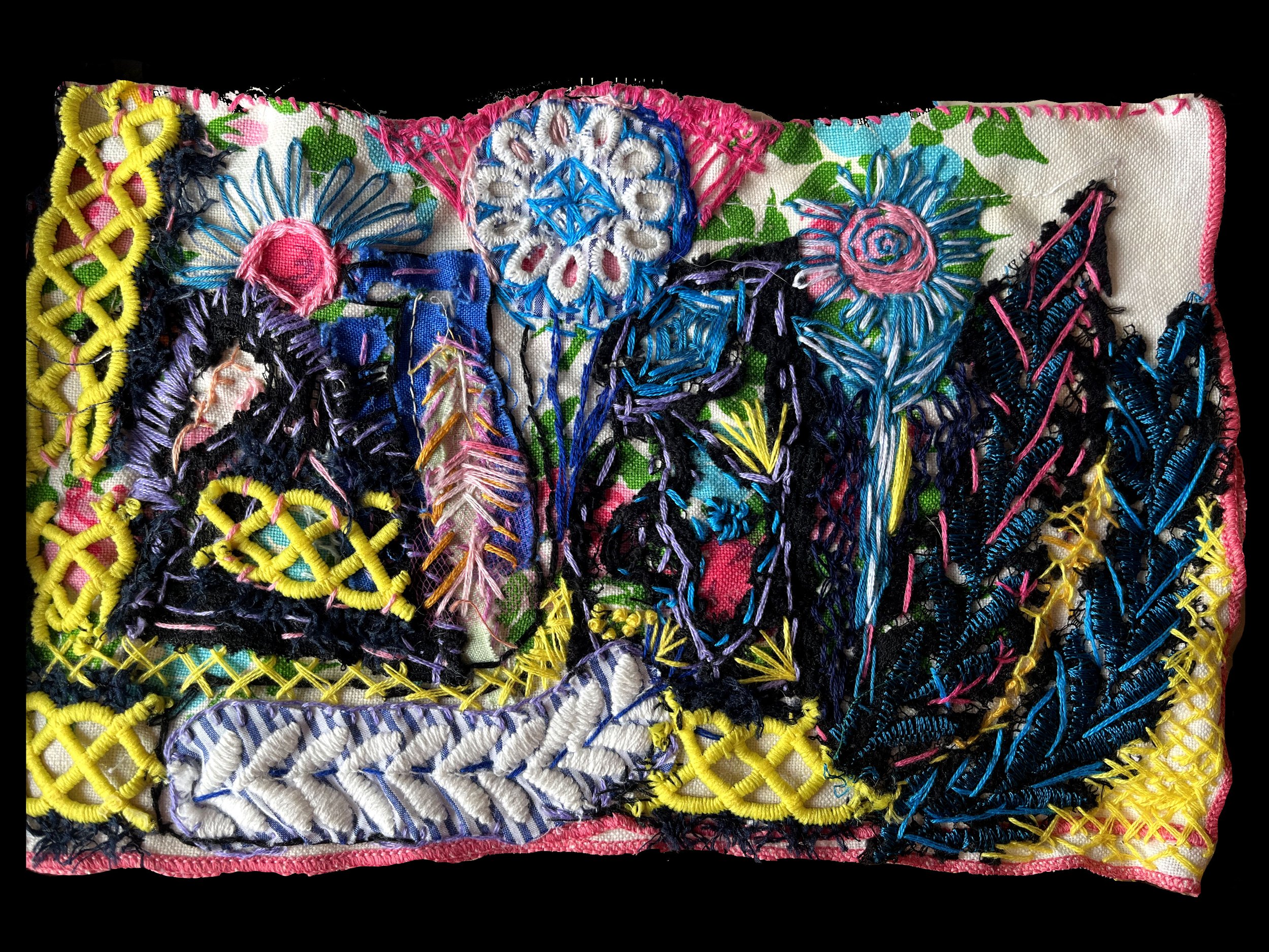
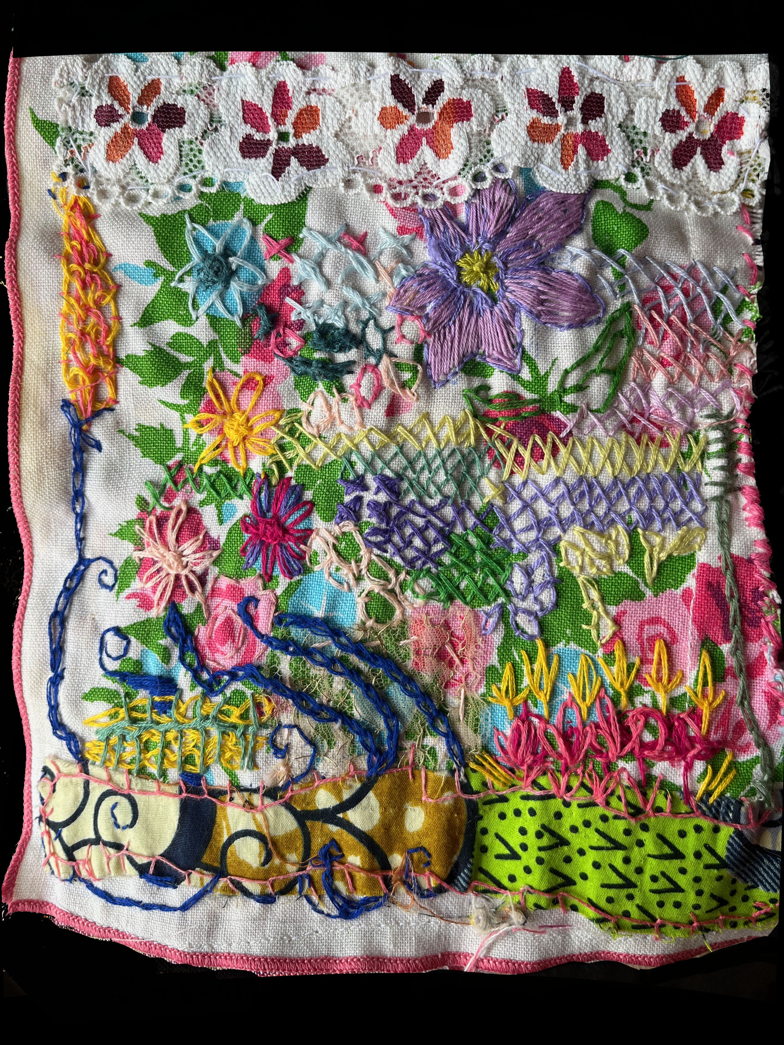
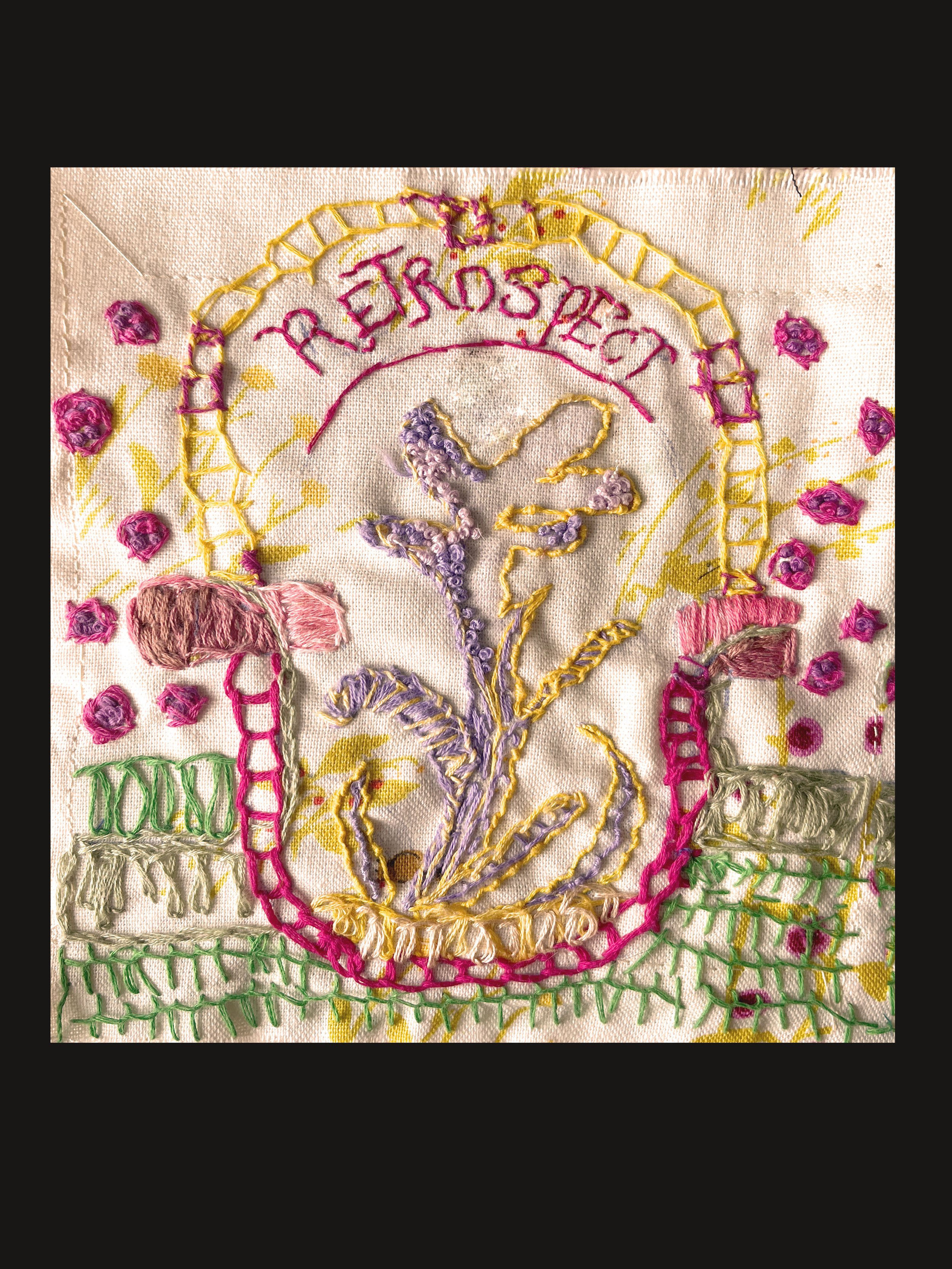
And a few extra images of the books for your viewing pleasure: